As a designer, understanding color psychology is crucial. Colors evoke different emotions and behaviors in people, and using the right colors in your designs can influence how your audience interacts with your product or brand. In this guide, we will explore the impact of color on emotions and behaviors and provide you with practical insights to help you use color psychology effectively in your designs.
Thesis Statement
Effective use of color psychology is a critical aspect of design that can influence the emotions and behaviors of your audience. By understanding the meaning behind each color and using them strategically in your designs, you can create a lasting impression on your audience and communicate your desired message effectively
Introduction: The importance of color psychology in design
Color is a fundamental aspect of design that can have a significant impact on the emotions and behaviors of your audience. Whether you’re designing a website, a product, or a marketing campaign, using the right colors can help you communicate your message more effectively and create a more memorable experience for your audience. In this section, we will explore why color psychology is essential in design and how it can help you create designs that resonate with your audience.
Firstly, color is one of the first things people notice when they interact with a design. Research has shown that people make a subconscious judgment about a product or brand within 90 seconds of their initial interaction, and up to 90% of that judgment is based on color alone. This means that choosing the right colors for your design can have a significant impact on how your audience perceives your product or brand.
Secondly, colors can evoke different emotions and behaviors in people. For example, warm colors such as red, orange, and yellow can evoke feelings of passion, energy, and excitement, while cool colors such as blue, green, and purple can evoke feelings of calmness, trust, and security. By understanding the psychological associations of different colors, designers can use colors effectively to influence how people feel and act when they interact with their designs.
Finally, color can also be used to create a strong visual identity for your brand. By consistently using the same colors across all your marketing materials, you can create a strong association between your brand and the emotions and behaviors you want to evoke in your audience. This can help you create a lasting impression on your audience and establish a unique brand identity that stands out in a crowded marketplace.
The science behind color psychology: How colors impact emotions and behaviors
The impact of color on emotions and behaviors has a scientific basis that can be explored through the field of color psychology. This section will delve deeper into the scientific principles that explain how colors impact emotions and behaviors, and how these principles can be used to inform effective design choices.
One of the key scientific principles that underlie color psychology is the concept of color harmony. Color harmony refers to the idea that certain color combinations are more pleasing to the eye than others. When colors are combined in a harmonious way, they can create a more cohesive and visually appealing design, which can enhance the emotional impact of the design on the viewer.
Another principle of color psychology is the concept of color contrast. Color contrast refers to the way that colors interact with each other to create visual interest and emphasize important elements in a design. For example, using a bright color against a neutral background can draw attention to a specific element in the design and create a sense of contrast that is visually engaging.
Additionally, color psychology explores how colors can evoke specific emotions and behaviors in people. For instance, the color red is often associated with excitement and passion, while blue is associated with calmness and trust. However, the emotional associations of colors can vary depending on cultural and personal experiences. Designers must consider the cultural context of their audience when using color psychology to create designs that resonate with their target audience.
Finally, color psychology can also influence purchasing behavior. In marketing, colors are often used to evoke specific emotions and behaviors that encourage customers to make a purchase. For example, red is often used to create a sense of urgency or excitement, while green is associated with relaxation and balance.
The psychology of different colors: Understanding the meaning behind each color
Colors have different meanings and associations that can evoke specific emotions and behaviors in people. This section will explore the psychology of different colors and the emotional associations that they can create.
Red is a warm, bold color that is associated with passion, love, and energy. It can also evoke feelings of anger and aggression in some contexts. In design, red can be used to create a sense of urgency or excitement and can be effective for calls to action and marketing campaigns.
Orange is a bright, energetic color associated with warmth, creativity, and enthusiasm. It can also be associated with caution and danger in some contexts. In design, orange can be used to create a sense of playfulness and draw attention to specific elements in the design.
Yellow is a warm, happy color that is associated with optimism, confidence, and joy. It can also evoke feelings of anxiety and fear in some contexts. In design, yellow can be used to create a sense of happiness and energy and can be effective for brands that want to communicate a sense of positivity and warmth.
Green is an excellent, calming color that is associated with nature, growth, and harmony. It can also evoke feelings of envy and jealousy in some contexts. In design, green can be used to create a sense of balance and relaxation and can be effective for brands that want to communicate a sense of environmental responsibility.
Blue is a fantastic, calming color that is associated with trust, security, and reliability. It can also evoke feelings of sadness and depression in some contexts. In design, blue can be used to create a sense of trust and security and can be effective for brands that want to communicate a sense of reliability and professionalism.
Purple is a rich, luxurious color that is associated with creativity, royalty, and luxury. It can also be associated with mystery and spirituality. In design, purple can be used to create a sense of elegance and sophistication and can be effective for high-end brands and products.
By choosing the right colors based on the emotional impact they want to create, designers can create designs that resonate with their audience and communicate their desired message effectively.
Using color psychology in design: Tips and best practices
Understanding color psychology is only the first step; the next step is to apply this knowledge in design effectively. This section will provide practical tips and best practices for using color psychology in design.
The first step in applying color psychology in design is to consider the emotional impact that you want to create. For example, if you want to create a sense of energy and excitement, you might choose warm colors such as red, orange, or yellow. If you want to create a sense of calmness and relaxation, you might choose cool colors such as blue, green, or purple.
Another important consideration when applying color psychology in design is using colors consistently across all your marketing materials. By using the same colors consistently, you can create a strong association between your brand and the emotional associations that you want to create in your audience.
It’s also important to consider the cultural context of your audience when using color psychology in design. Different cultures may have different emotional associations with different colors, so it’s essential to understand the cultural context of your target audience to create designs that resonate with them effectively.
In addition, it’s essential to consider color harmony and contrast when applying color psychology in design. By using colors in a harmonious way and creating contrast where needed, you can create a visually appealing design that enhances the emotional impact of the design on the viewer.
Finally, it’s important to test your designs with your target audience to ensure that they resonate with them effectively. A/B testing is an effective way to test different color schemes and determine which ones are most effective for communicating your desired message to your audience.
Case studies: Examples of successful use of color psychology in design
Real-world examples demonstrate the power of color psychology in design, showcasing how colors can evoke specific emotions and behaviors in people. This section explores four case studies that showcase how brands have effectively applied color psychology to create strong emotional connections with their audiences.
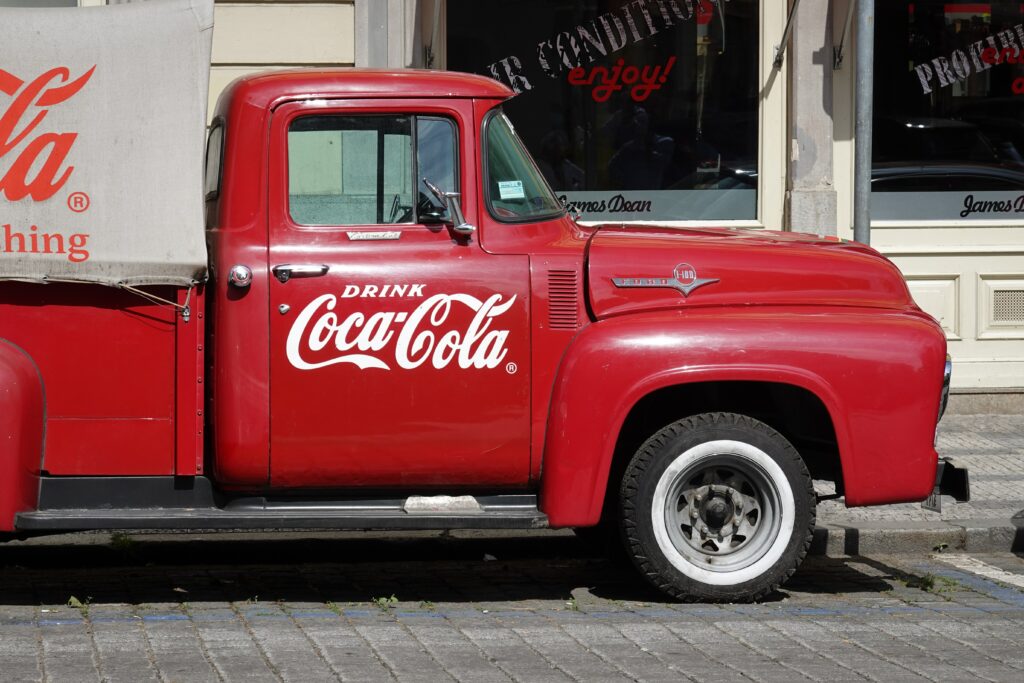
Case Study 1: Coca-Cola
Coca-Cola is a classic example of a brand that has successfully used color psychology to create a strong emotional connection with its audience. The company’s signature color is red, which is associated with passion, excitement, and energy. By consistently using red in its marketing materials, Coca-Cola has established a strong emotional association between its brand and the feelings they want to evoke in its audience. The company’s use of red has been so effective that the color has become synonymous with the brand itself, demonstrating the power of color psychology to create a unique and memorable brand identity.
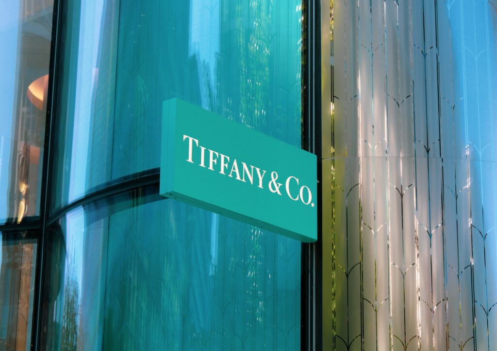
Case Study 2: Tiffany & Co.
Tiffany & Co. is a luxury brand that has effectively used color psychology to create a strong brand identity. The company’s signature color is Tiffany Blue, a shade of light blue that is associated with sophistication, luxury, and elegance. By consistently using Tiffany Blue in its marketing materials and branding, the company has created a unique and recognizable brand identity that sets them apart from its competitors. The use of Tiffany Blue has become so synonymous with the brand that the color itself is often referred to as “Tiffany Blue,” demonstrating the power of color psychology in establishing a strong brand identity.
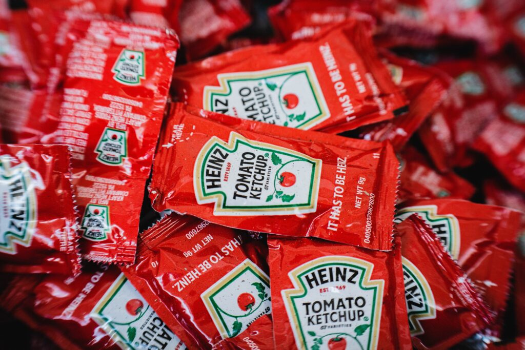
Case Study 3: Heinz
Heinz is a food brand that has effectively used color psychology in its packaging design. The company’s signature color is red, which is associated with excitement and energy. By using a bold shade of red in their packaging design, Heinz has created a visually appealing design that draws attention to their products and communicates the energy and excitement associated with their brand. The use of red in their packaging design has been so effective that it has become synonymous with the brand itself, demonstrating the power of color psychology in creating a strong visual identity for a brand.
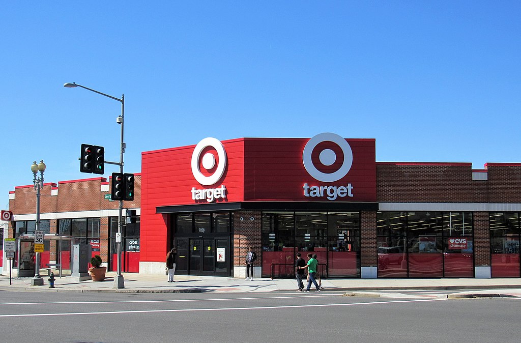
Case Study 4: Target
Target is a retail brand that has effectively used color psychology in its marketing campaigns and branding. The company’s signature color is red, which is associated with excitement and energy. However, the company also uses a variety of other colors such as yellow and green to create a sense of playfulness and appeal to a wide range of customers. The use of multiple colors in its branding and marketing materials has helped Target establish a unique and recognizable brand identity that appeals to a wide range of customers. This demonstrates the power of color psychology in creating a brand identity that appeals to a broad audience.
These case studies demonstrate the power of color psychology in creating effective designs that resonate with audiences. By using color effectively, brands can create a strong emotional impact, establish a unique brand identity, and create a memorable visual identity that sets them apart from their competitors.
Conclusion: The power of color psychology in design
Color psychology is a powerful tool that can help designers create designs that resonate with their audience. By understanding the meaning behind each color and how they impact emotions and behaviors, designers can use colors effectively to influence how people perceive their products or brand. By using color psychology effectively, designers can create designs that communicate the desired message effectively and create a lasting impression on their audience.


